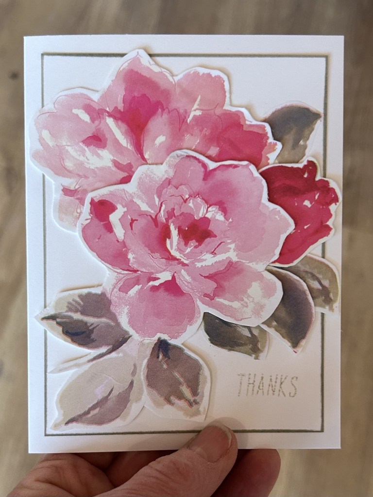
Friendship Friday

Hello Friend


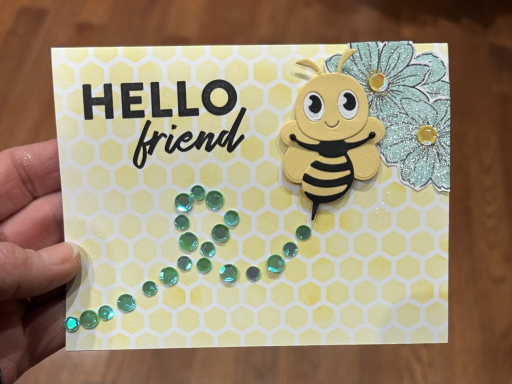
main products: sequins from door 18 and door 9 of Spellbinders Advent Calendar along with bee from door 6; Brutus Monroe honeycomb stencil, Stampin’ Up! Friendly Hello stamp set (flower and sentiment), ‘Altenew Dew Drops and Honey Drizzle inks, Wink of Stella glitter pen.

I must admit that when I opened door number 18 last night to find sequins my cardmaking energy rapidly dwindled. I was not feeling like making a shaker card even though I always love them once they are complete. I took some inspiration from some Sending Hugs cards that I had made a long time ago but had not sent. I used them as a model for some cards that we made last Monday at my in-person Card Crew class at the Dementia Society. I had 5 participants plus 2 caregivers and that was a really fun card design for us all to work on together. Some punches, some die cuts, some stamping, some glueing, and a nice message – who doesn’t like to send and receive hugs?

Originally I thought I might use the sequins to intersperse amongst some hearts, but in the end the You are Sweet card that I had made with that cute spellbinder bee behind door number 6 called out to me more as a starting point to use sequins on a card.

I am quite happy with how the Hello Friend card came out. I used wink of stella pen mixed directly with a few drops of Altenew inks directly from the reinker bottle to colour in the flowers. I popped up the bee with foam for a bit of dimension. I could have popped up the flowers too, and I think I would have like to have had a bigger third flower so should have stamped an extra one rather than just using the bit that I had trimmed off that was hanging over the edge of the card. I might have used a heavier weight cardstock or could have blended the honeycomb stencil onto a front panel rather than directly onto the front of the cardbase.

You are Sweet

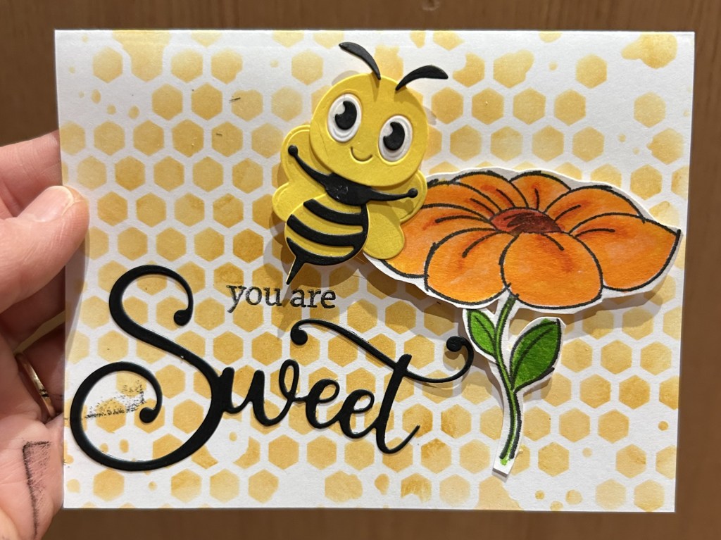
main products: bee from door sweet die cut from Scrapbook and Cards today Sampler pack, flower stamp from a Stampin’ Up! set, honeycomb stencil, Altenew watercolour brushes to colour flower.

I like the slightly messy look of the honeycomb stencil. I might have preferred to have the stemp of the flower going off the right hand side of the card rather than randomly just ending mid-card. I like how I popped up the bee. I wish I hadn’t smuged black ink on the card front but, as Gina K says, the card is better than horrible. And that’s good enough. I really like the big sweet die-cut sentiment but wish I had taken a bit more time and stamped the ‘you are’ straigher and used my MISTI so that I could have inked it a few times to make it nice and black like the ‘sweet’.

Sending Hugs

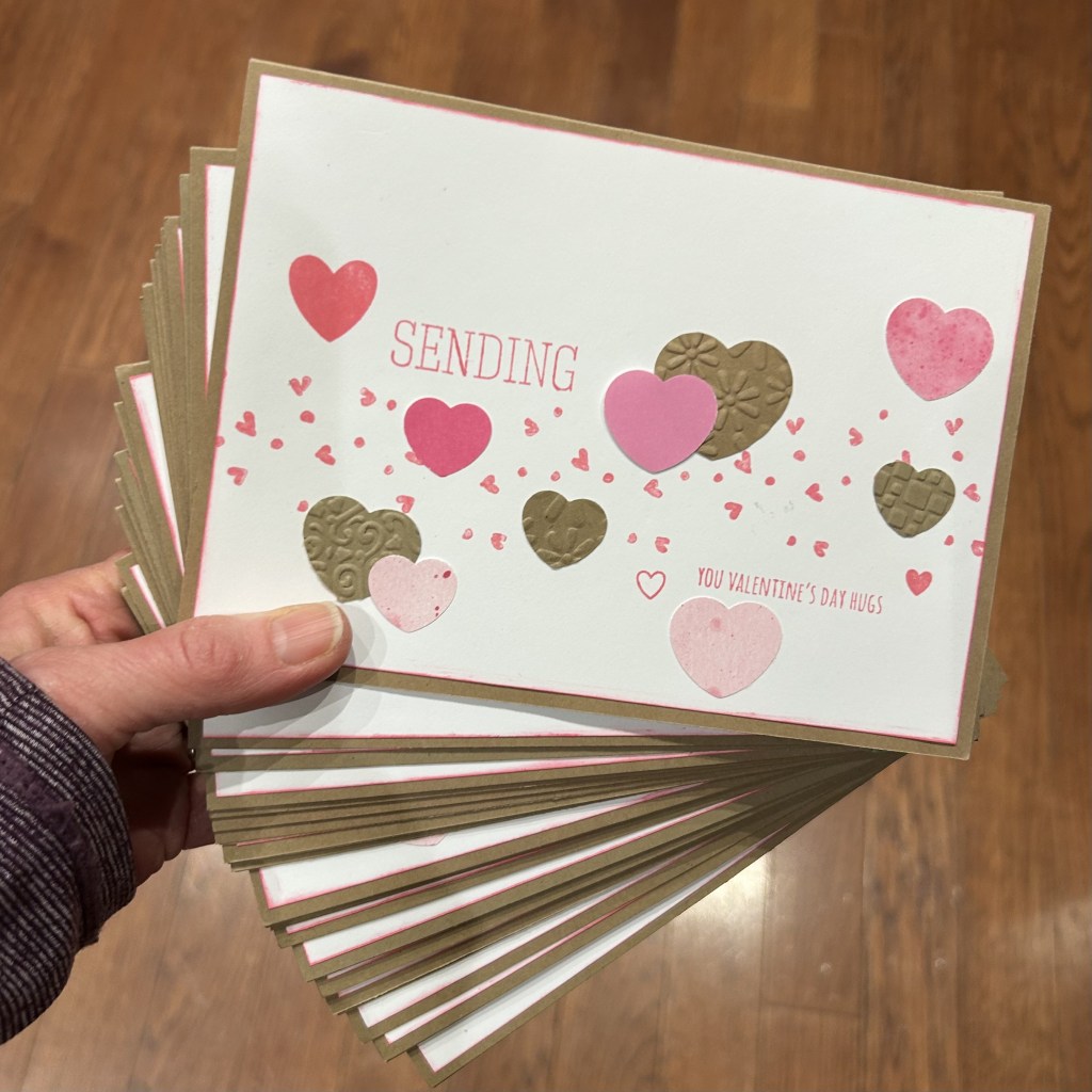
I don’t want to emphasize that the hugs were supposed to be Valentine’s Day hugs. In hindsight a more generic hugs sentiment would have been better. In reality, it doesn’t matter that much; I can send Valentine’s Day hugs any time of the year. I think they will still be appreciated. And, I hope to actually get around to sending some of them out very soon. They have been sitting around for way too long. And it has been way too long since I’ve had a regular practice of actually sending out my cards. Hopefully I’ll have a big stack of cards to send out on an upcoming ‘Mail it Monday’.

This is a really fun card design. I like the mix of kraft and white and pink. I like the swath of mini hearts stamped across the card and the randomness of the pink and kraft hearts scattered about. I enjoyed using my Quickutz texture plates to emboss the hearts with a nice variety of textures. It is a fun and easy card to put together. Perhaps it would have been nice to include some glitter or shiny hearts and perhaps to pop some up for a bit of dimension. Using a stencil with tiny hearts along with some coloured embossing paste rather than stamping the mini hearts would have been a fun (but messy) way to have added some more dimension and texture to the card.

Friendship Friday

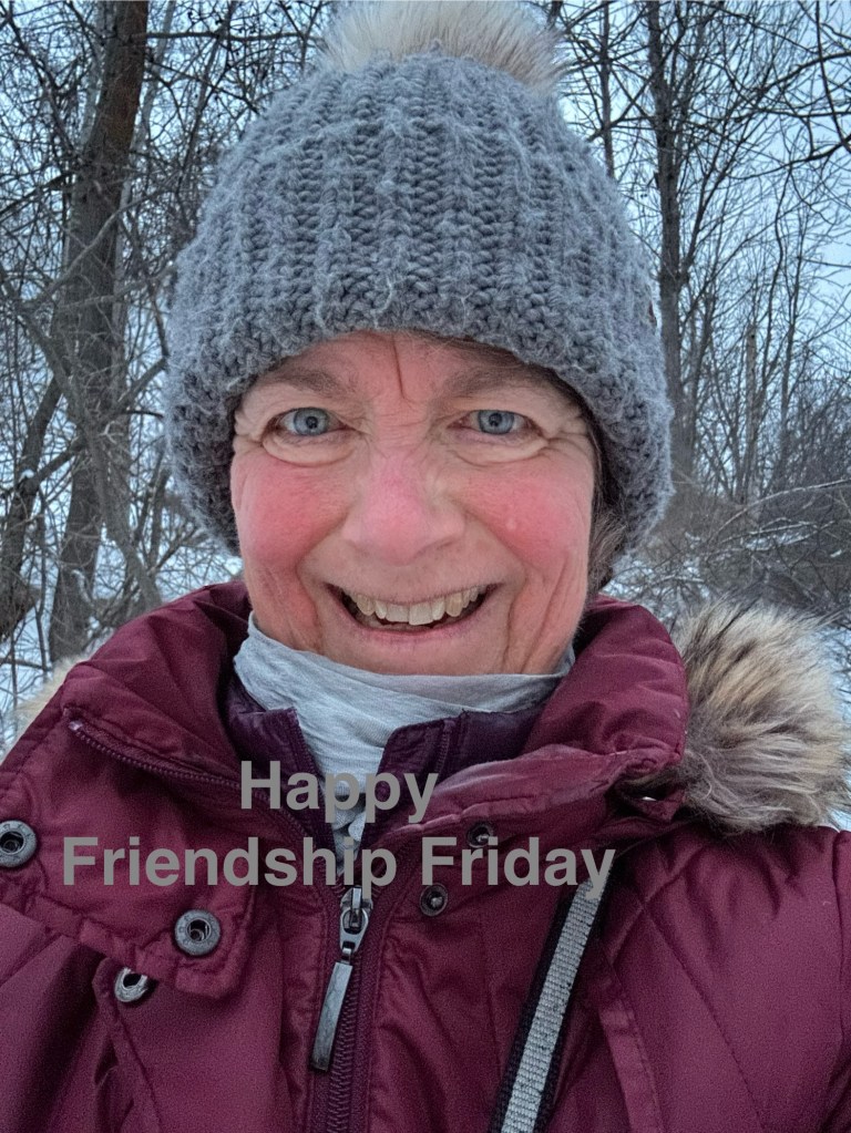
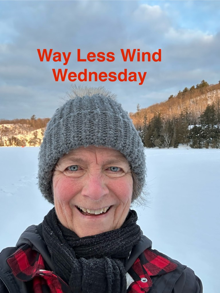
I got the idea for having a theme for the day from Kessonge when he was hosting Radio Headspace. For a week he opened his episode something like It’s a Marvellous Monday. It’s a Terrific Tuesday. It’s a Wonderful Wednesday. You get the idea. And I liked the idea. It kind of reminded me of wishing a colleague a good morning when you crossed paths with them at the hall in the office. Since I had then already been retired for a few years, I realized that I wasn’t having nearly as many chance encounters with people. But that I could intentionally reach out to friends to wish them a good day. And, although I wouldn’t be seeing them face to face, I could send them a photo of me as if I was wishing them a good day. Who knows, maybe it is kind of jarring for my friends to see a photo of me when they open our text thread and they’d rather just receive a few words, a couple of emojis or a gif. But, I choose to believe that they appreciate my goofy gesture. I know it always makes me smile when I receive a selfie from a friend. It’s not quite as good as seeing them in person, but it definitely helps start my day off in a fun way.

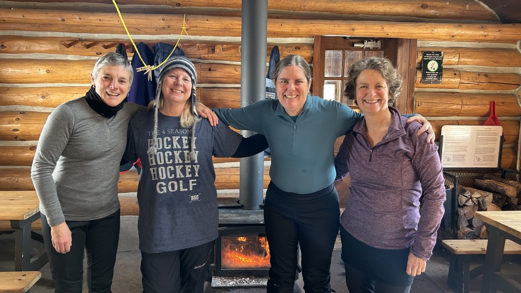
Today might have been a Fantastic Friday, a Fabulous Friday, or even another Finish it Friday. But I really felt today’s theme should be Friendship Friday. Because I’ll be seeing some friends today. One of them, Anne, is from out of town. I met her more than 30 years ago playing hockey back when she was living in Ottawa. She moved back to Oakville a few years later, but we’ve kept in touch. She makes the trip up here to Ottawa almost every winter for an annual cross country ski in Gatineau Park and a skate on the Rideau canal. To spend time doing some of her favourite actitivies with her Ottawa friends. I so appreciate her making the trip. I so appreciate her friendship. While it’s great that we text each other, and that we have some ‘walks and talks’ taking our respective dogs out for a walk and that we had quite a few Zoom calls during Covid, it is so nice to see her in person. Either when we’re down in her neck of the woods, or when she’s back up here in mine. Or when we’re somewhere else together on a hiking or kayaking adventure.

Here’s a photo from today with Anne, Andrea and Flora. And a photo from 1993 with Andrea, Anne and Laura, from back when we wondered if we’d still be skiing together when we got into our 60’s. I am so glad to report that we are. I will eventually get around to putting together a collection of photos of all of the years that we have cross country skied (and skated on the canal) together. But that’s a story and a project for another day. It’s time for me to head back over to visit with Anne and her aunt, to take advantage of the time we have to spend together in person.

Way Less Wind Wednesday

I was thinking about calling it Windless Wednesday but there actually was a still a bit of wind as I went down to the lake to snowshoe. And there definitely had been wind yesterday since I had snowshoed. My tracks were once again almost completely covered with snow. A few weeks ago I had commented to a friend that it seems like there haven’t been nearly as many snowdrifts around as there were ‘back in the day’. Well, now that we have a winter with a lot of snow and wind, there has definitely been a lot of drifting snow. Be careful what you wish for.

But it was almost windless as I trudged through the snow, once again reestablishing a trail, following my barely discerable tracks from yesterday. But it was definitely easier going then yesterday. For one thing, when I managed to stay in the trail the snow was quite firm – the wind had done a good job of packing that freshly blown snow down into the trail. For another thing, I could hear the birds chirping. It was nice to have company on my morning trek, a cheering section of sorts. I’m not sure if they had been out on those other windy days and I just couldn’t hear them cheering me on, or if they had been wiser than me and had simply avoided being out on a cold and windy morning. But I was glad that they were there, and that I was paying attention to what was going on around me instead of being totally lost in my thoughts. It’s funny how much of the beauty around us we can miss when we’re lost in thought.

There was even a glimmer of sunshine when I slowed down to pay attention. It’s not yet a blue sky day, but it reminded me that the sun is always up there above the clouds. And we can choose to live each day as if it is a sunny day, because each day actually is a sunny day. And we can remember that our cheering section is nearby, whether or not we can hear their cheerful encouraging calls above the wind or not.

Just Saying Hello

Main product: Spellbinders Advent Calendar, door 10

I was pretty happy with how the card turned out. I have a few tips and ideas for what I could change.

Adhesive:

Because the flowered paper was so thin, I wanted to have adhesive behind the whole image and not just partially adhered as I might a thicker paper. I glued the thin paper directly onto the card front. The ‘spread’ end of the Tombow mono glue bottle worked very well to spread out the glue. I clean out and refill my Tombow bottles – I just remove the label to know that it is no longer the mono glue. I really like it as a dispenser with the versatility of both ends. Paint brushes and sponges are other ways to achieve a thin, even layer of glue over a complete surface. Another option would have been to adhere the flowers onto a sheet of double-sided adhesive paper before fussy cutting around them. There wouldn’t have been a need to deal with a wet adhesive with the potential mess of it as well as the tendancy that a wet adhesive can cause some wrinkles in thin paper.

I noticed that the cardstock does curl up a bit. Using double sided adhesive paper to adhere the flowers would have prevented that curl. Or it might be better to glue the flowers onto a front panel then adhere the panel onto the card base. Or to adhere the flowers with glue to a cardstock then fussy cut around them – that would give them more dimension rather than the look of the thin flowers being right against the card layer.

I may try to put the card in a heavy book for a while to flatten it out. Or to run it through my die cutting machine, with no die or embossing folder, the pressure of the plates can flatten cards.

It would have been easier to adhere the sentiment if I had cut them from adhesive-backed cardstock rather than needing to use liquid glue. I did use a fine tipped glue bottle which helps – you could also use a paint brush or sponge to apply a thin layer of glue rather than dots of glue behind the sentiment. I had some adhesive-backed cardstock at home but not with me at the cottage. You can create your own by running some two-sided tape or putting a piece of double-sided adhesive paper behind the cardstock before you run it through your die cutting machine.

Work Surface:

I use a thick mylar sheet as a work surface – it is easy to later wash off the glue and ink. These mylar sheets are great for transporting to my workshops. The mylar turned out to be too thick to cut on the Cricut to make stencils – but I will eventually learn how to use the City of Ottawa library laser cutting machine and will try that for making stencils. At home I have a glass work surface (a glass shelf from an old fridge). I also have a sheet of teflon both here at the cottage and at home.

Design:

To make it closer to a ‘one layer card’ it might have been nicer to stamp the sentiment rather than to use the die cut sentiment. Or, if I wanted to further emphasis the dimension of the sentiment, I could have cut it out a few extra times and stacked the layers.

I could have taken a bit more time to line up my sentiment so that the bottom and side margins were the same. To fix that problem I could have trimmed down the card front and adhered it to a new card base.

If you don’t have the correct colour of cardstock to make your sentiment, you can always ink blend a piece of cardstock before running it through your die cutter.

Adding a bit of bling using an odd number of clear dots or sequins would have been a nice finishing touch for this card. I’ll have to bring some of them up to the cottage.

Thanks

Main Product: Spellbinders Advent Calendar door 13

This time I adhered the thin floral paper to 110 lb cardstock before fussy cutting out the images. I really like the added dimension that it gives the layers of flowers and leaves.

I did use a thin layer of liquid glue to adhere the flowers to the cardstock. I notice that it is lifing up in a few spots. I could have been more careful to make sure I had a good but thin layer covering the whole flower. Or I could have adhered the thin paper to adhesive backed cardstock or used a double-sided adhesive sheet to adhere the thin paper to the thicker cardstock.

I inked the edges of my 3-3/4″ x 5″ layer to give it some added dimension. It might also have been nice to mat that layer with a layer of beige cardstock. A thin piece of craft foam or chipboard would have added some extra dimension.

I might try to make a similar card using a beige 3-3/4″ x 5″ layer rather than a white layer; in which case I would use a white heat-embossed sentiment or a sentiment strip. Or a brighter red/pink ink for the sentiment. Or perhaps die cut the sentiment rather than using a stamp. See the image a bit further down for my attempt today at making such a card.

I don’t have a lot of inks up here with me at the cottage so I was thrilled to realize that the Altenew Pink Sand ink was a perfect match for the leaf colour. So it was a great colour for inking the edges of the front layer. I think it was a bit light for my ‘thanks’ sentiment. Next time I would try to the Crimson or Velvet colour from that Red Sunset ink set. I think a bolder colour would have added in a nice contrast and would have matched the red of the bud and the highlights in the gardenias.

Adding a bit of bling using an odd number of clear dots or sequins would have been a nice finishing touch for this card, too.

Hello

Main Product: Spellbinders Advent Calendar door 14, doggy die cut

Even though I don’t love putting together tiny die cut pieces, I do love how this cute fellow turned out. I do wish I had had some adhesive-backed cardstock on hand to make the assembly easier, but the fine-tipped glue bottle certainly helped. Rather than using coloured cardstock, I die cut all the pieces from white cardstock then ink blended them. I used black ink to make the grey colour as well as Altenew Blush for the pink and Crimson for the red. I used a black pen to colour in the eyes.
I thought that the ink-splatted paper from an old Scrapbook and Cards Today (SCT) Crop and Create online class had the right amount of spunk to go with this saucy pup. I used the Spellbinders door 11 embossing folder on the black cardstock to give it some fun geometrical dimension.

If I was to make this card again I might try the hello in red, but there is already a nice trio of red elements which is why I opted to cut out a white hello rather than to use the red one I had ink blended. I might also centre the dog up a bit more rather than putting the combined dog and heart along the centre line. I might have tried to mat the black with another layer of white/beige and black. In an ideal world I would have had those white elements the same light beige as was in the ink-splattered patterned paper. I have some dog-themed stamps at home that I’ll use to stamp the front and back on an envelop as well as the white inner layer I put on the inside of my card. Maybe it would be nice to put the dog on a heart shape rather than on the square and to move the small heart down lower beside the hello. But, the other doors of my Advent calendar are calling so I will move on. And, I will soon be starting my 100 day project of working my way through my Altenew Educator Certification Program (AECP).

Hello Fruity Drink

Main Product: Spellbinders Advent Calendar – door 12

I am quite pleaseed with how this card turned out. It was a bit fussy getting the acetate die cut glass together. I was worried about the glue showing through, or not holding together, but it seems to be holding up fine.

I used the Spellbinders door 11 geometric embossing folder. I really like how the geometric pattern contrasts with the curved lines of the glass and lemon. Having the background in white allows there to be some texture while not drawing too much attention away from the focal point of the fruity drink. I might have tried to emphasize the curvy edge of the drink a bit more and could have cut the straw just a bit shorter so that it was in the centre of that oval at the top of the drink. I could have tried a pink or yellow hello instead of the bold black, perhaps I could have also added a few pink or yellow enamel dots or sequins for a bit of bling to step the card up just a bit. I’ll have to find some coordinating stamps to decorate the inside and back of the card as well as to make a coordinating envelope.