
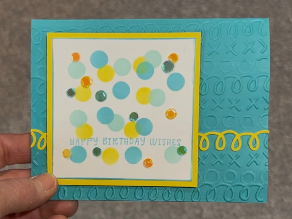
Spellbinders Door 20 | Happy Birthday Wishes
I liked how the sequins went quite well with the circle / confetti look of the layered stencils. It would haave been nice to have had a diecut shape of some type in the centre for added interest. A birthday cupcake would have been nice. My friend, Shelli, who gave me the Advent Calendar put a die cut sundae in the centre of her confetti and it looked great. I’m not sure if I should have had the yellow die cut curly streamers on both sides of the card; it may have looked better just having it on the right hand side?
Main Products: Spellbinder Advent Calendar door 5 curvy streamer die, door 9 yellow sequins, door 18 blue sequins, door 15 embossing folder, door 19 habby birthday wishes stamp and door 20 circle / confetti layering stencils. Altenew Inks: Fresh Lemon, Teal Cove, Aqualicious; Stampin’ Up! Hello Cupcake stamp set.

Last week’s ‘one tweak a week’ was to add in the 11-12 minute ‘one&done’ workout habit. I’m happy to report that I did the ‘speed’ workout every day last week. And I feel so much better for it. I’m starting to regain a bit of flexibility. This week I’m going to do the ‘agility’ workout. It’s easier to do the same workout each day for a full week.
This week’s tweak is still on the ‘moving’ theme. So, after my morning walk, Luna and I went for a 1k run. In the past I’ve enjoyed having a 2k/day run streak, but I don’t think I could be consistent at 2k this time around. So I’m aiming for 1k/day. Right after my walk. I may end up moving my ‘one&done’ to before my walk.
Someone had commented that, now that my mom has passed, it may seem like I have a lot more time. I estimate that I was spending about 10 hours a week on visits with mom, including driving time. So mom’s Celebration of Life, I started to think about what ‘moving on’ would look like. If you were suddenly to have 10 more hours in your week how would you want to spend them? I’m going to try to use one hour each day to build back up some great daily habits. And to use the other 3 hours a week on weekly habits. But I’m building up those habits gradually.
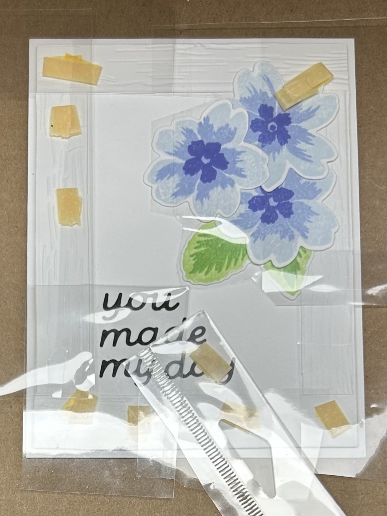
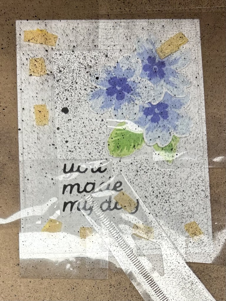
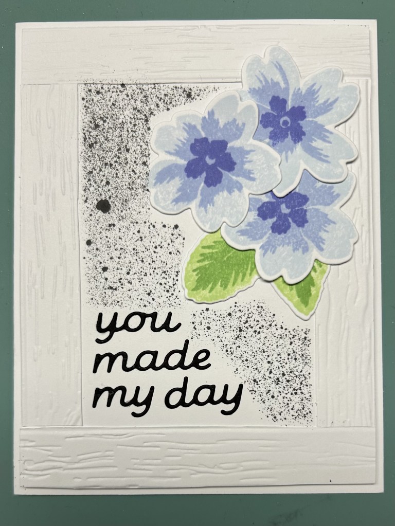
AECP Card 2 | You Made my Day
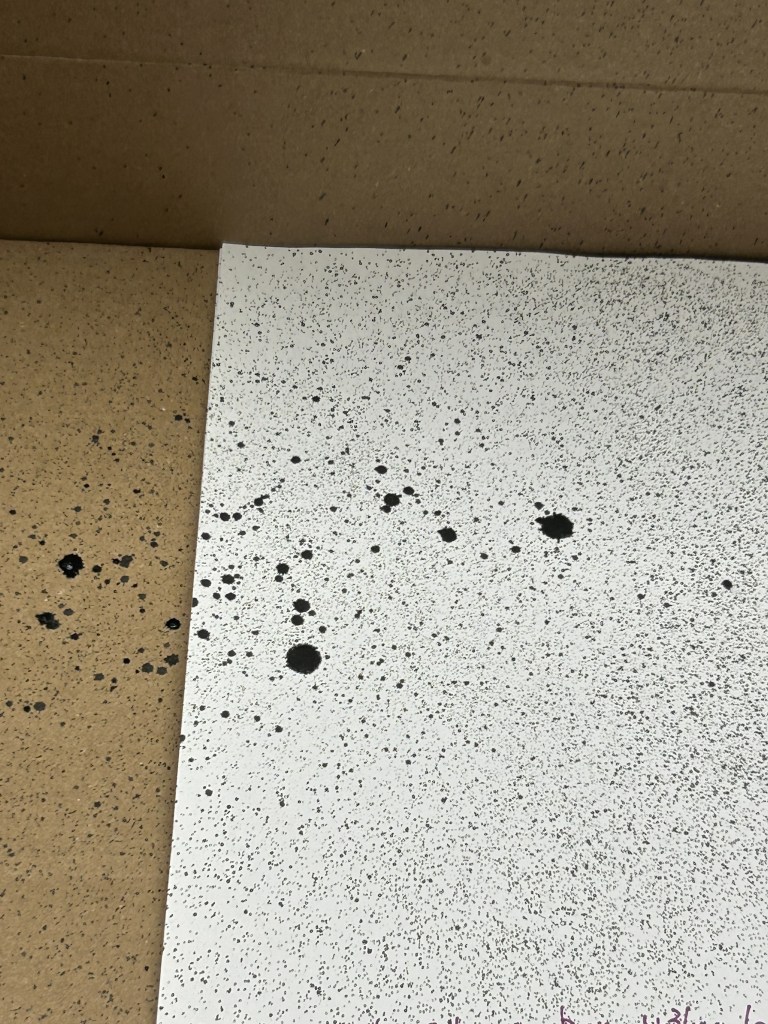
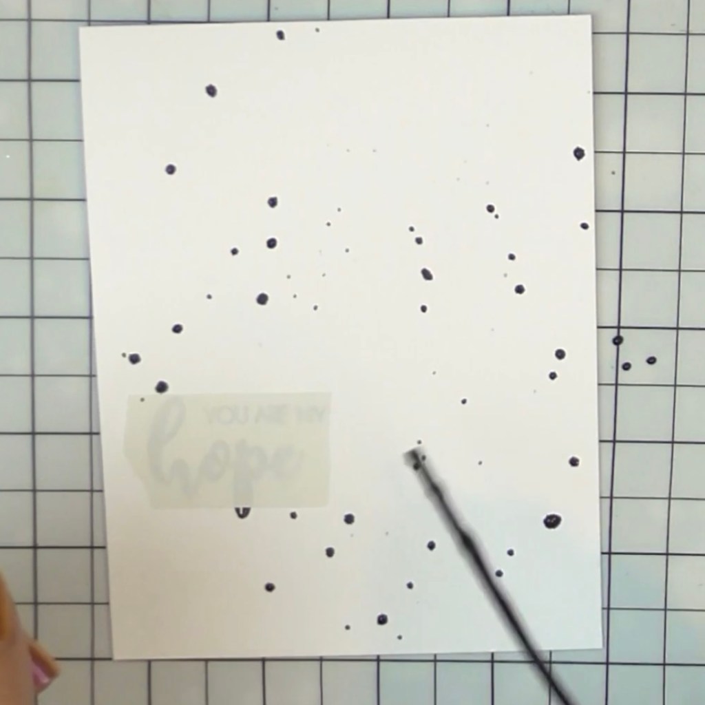
The second lesson of the All About Layering 3 class included a technique of spraying some black ink on the background. I really like the look of some random black ink dots on a card so I decided to invest in some black ink spray. And I repurposed a cardboard box to become my ‘spray box’. The lesson video (which I had watched 6-7 weeks) ago had recommended masking the sentiment so it is still legible. I decided to use another of the white ‘wood’ frame card fronts that I had made when I was working on Day 1 projects, so I had to mask that area off. And, I had glued my flower cluster down before spraying so I had to mask that area off as well. I decided to try masking with strips that I had cut from cellophane packaging that was going to go in the garbage any way. It worked well to see what I was masking.
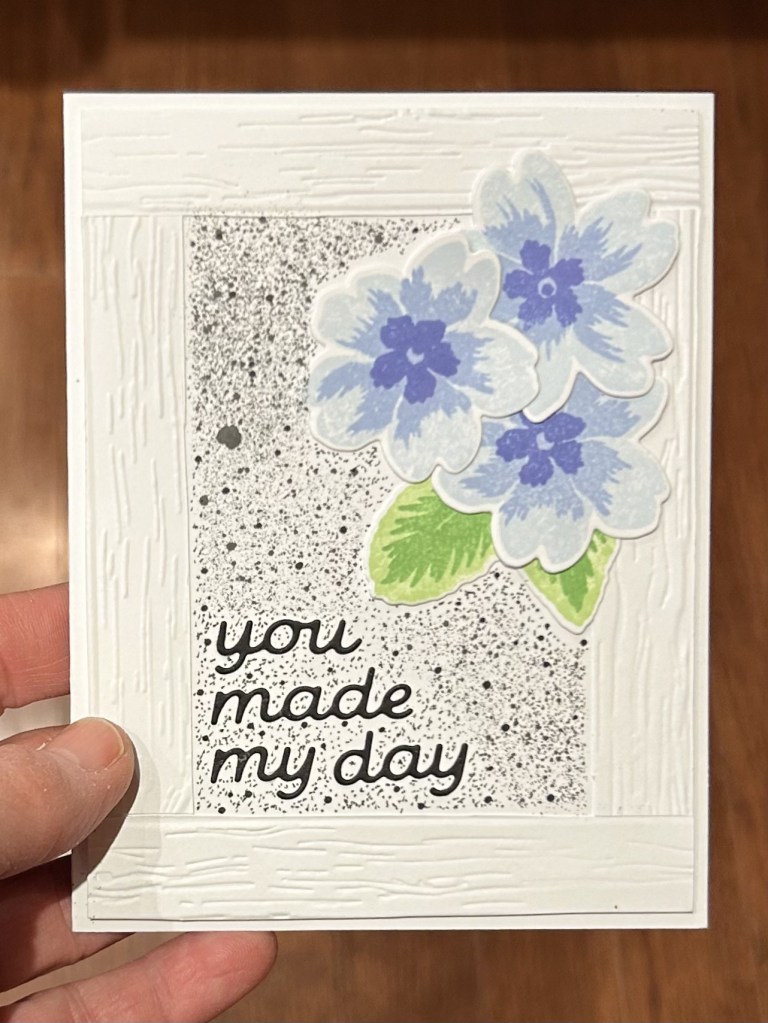
However, I did have some lessons learned: 1) it is better to cut closer to the edges of the mask; 2) it is better to spray before putting down a frame or your flower cluster; 3) the spray bottle makes a very fine mist – if you want to have just a few random dots it is better to take the spray mechanism off the bottle and simply gently tap it so that random dots of ink splatter on your project (I went back to rewatch the video since mine had come out so differently than what I had expected – I actually don’t mind the look I got – it was just different); 4) cellophane doesn’t make a great mask because the ink doesn’t absorb into it – I had to be very, very careful removing the mask so that I didn’t get black ink everywhere on my card front; 5) you can add in extra fine and not so fine black dots with a marker if you make your mask too big.
I think it might be nice to put some black enamel dots into the centre of the flowers to continue with the black accent design element.
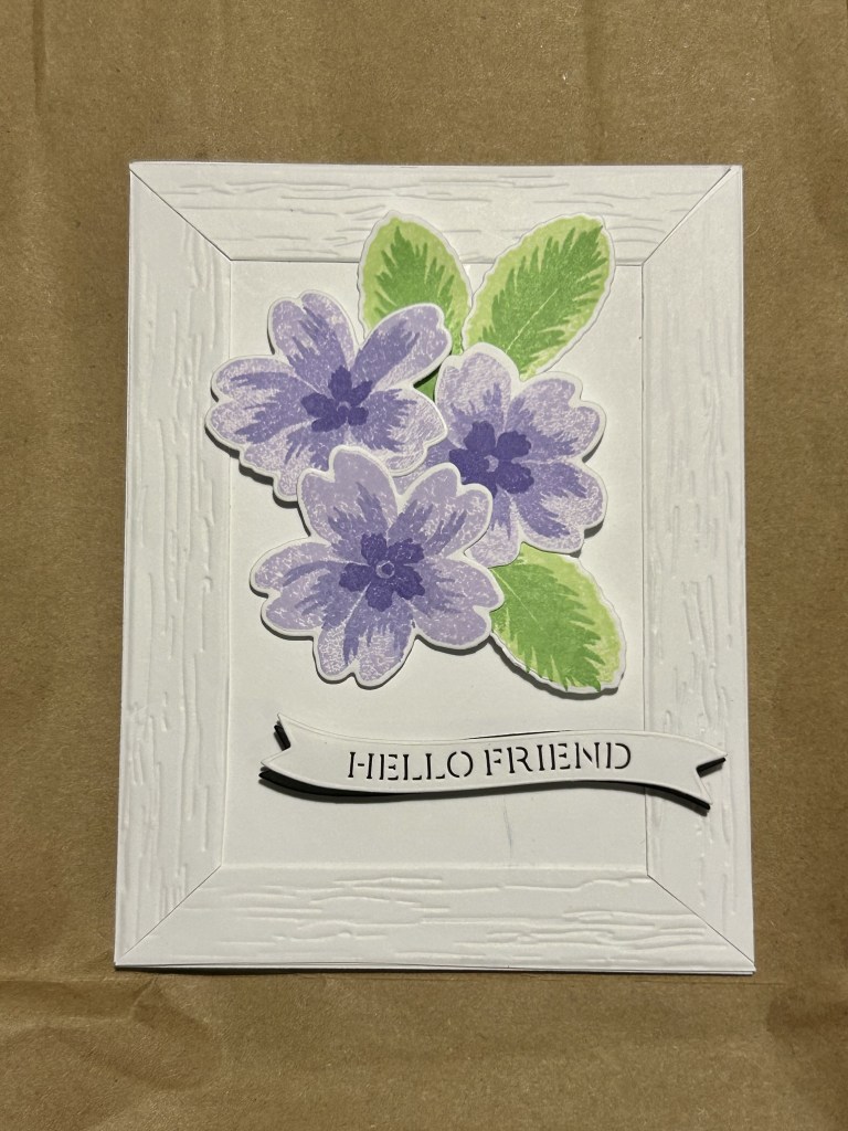
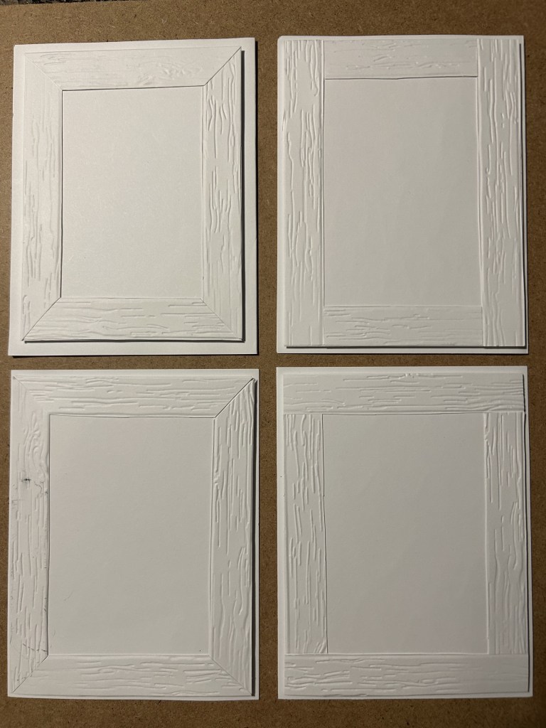
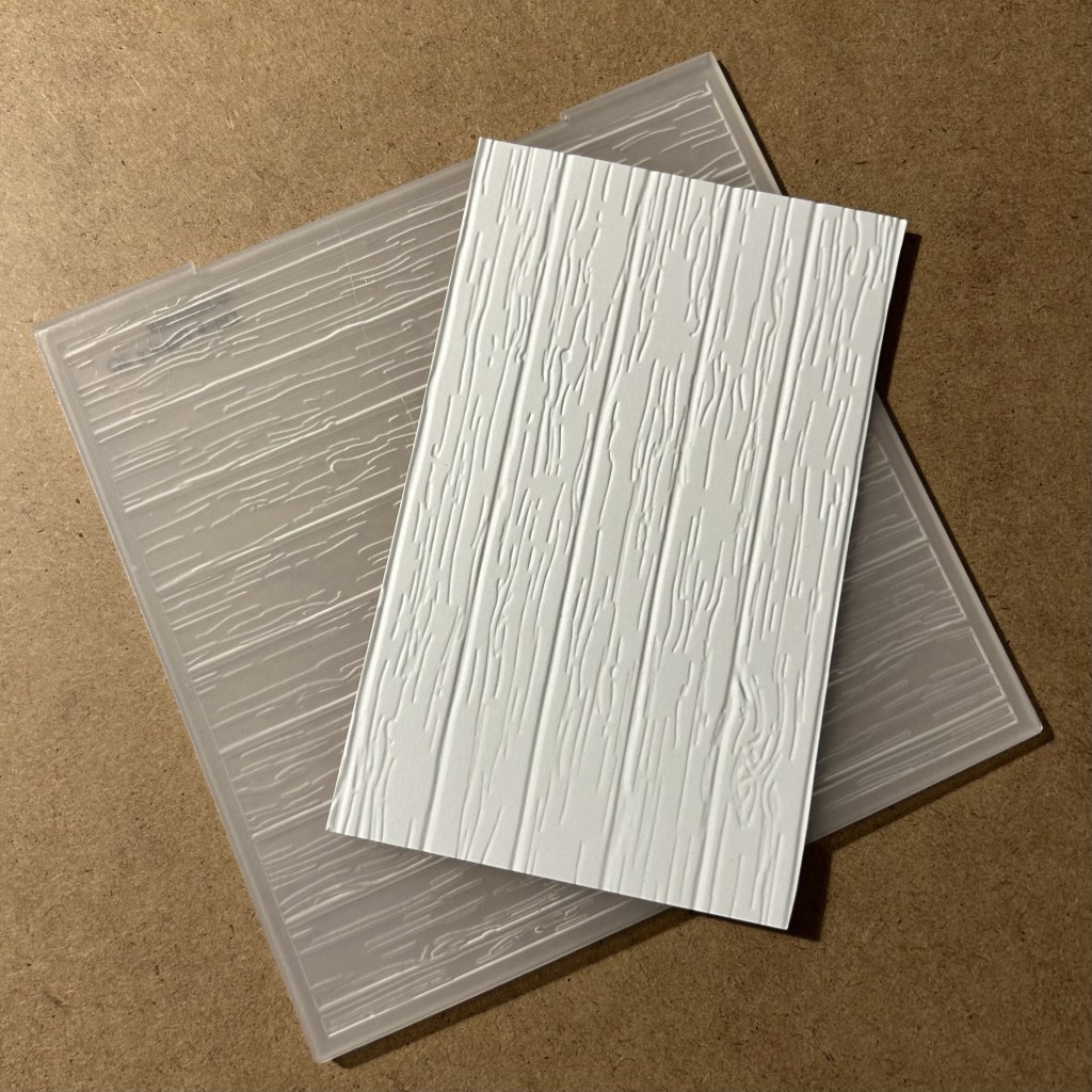
The card I made yesterday had the frame’s outer edges sized at 4-1/4″ x 5-1/2″. I decided to try a few different sizes. I liked the 4″ x 5-1/4″ the best. I think the 3-3/4″ x 5″ frame is a bit small. I also tried to make some unmitered frames which was certainly easier than mitering them. They look fine too, just a different look than mitered. I also think it would be interesting to try ink blending the frame planks – that may be a bit tricky to do on the panels that I already have frames adhered to.
Main Products
